DEADBOLT - Rebranded
Branding, Graphic Design, Print Design,

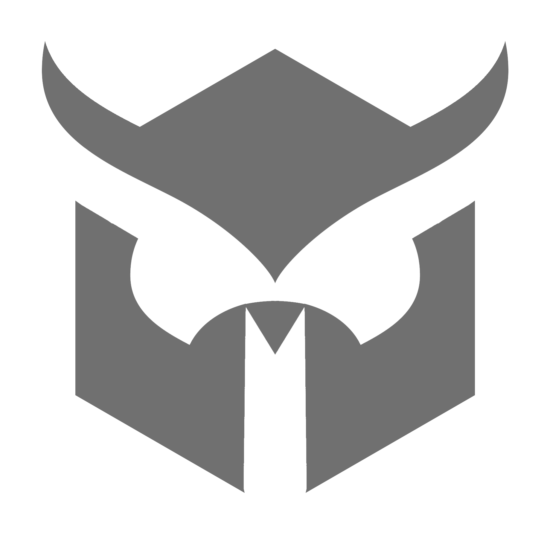
Say hello to Deadbolt, one of Manchester's best alternative nights. After working with them over the Summer I finally pitched them the idea of a much-needed rebrand.

I had some fun with their old logo over the summer but the diamond shape completely swamped the layout most of the time and was just cumbersome in every way. Having this time was good though as it allowed me to try new ideas and experiment with the logo in a number of visual styles, even changing it where necessary. This would come in handy when developing a futureproof new logo.

From the start my aims were to have a bold, clear logo that worked well in one solid colour. This would make it easy to use on a variety of different posters. Most of Deadbolt's events are themed in some way, so this adaptability was essential.

Generic Flyer. Using the boldness of white on black to reinforce the logo's simplicity.
